Histogram with a density overlay for numeric columns; a bar chart of the most
frequent levels for categorical/text/logical columns.
Usage
plot_distribution(df, column, bins = 30, max_levels = 20)
Arguments
- df
A data frame.
- column
Name of the column to plot.
- bins
Histogram bins for numeric columns. Default 30.
- max_levels
Maximum categories to show for categorical columns.
Default 20.
Examples
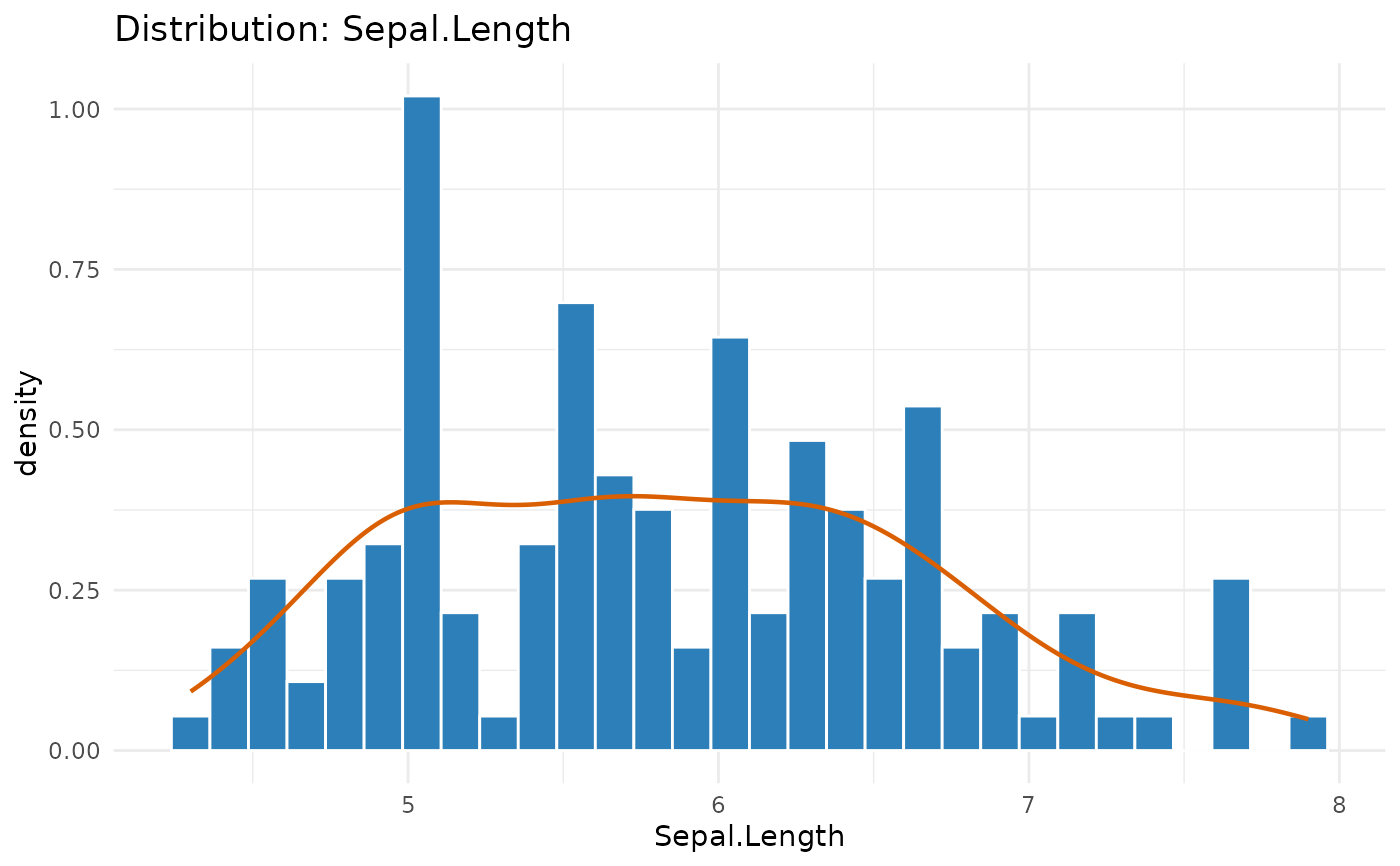
plot_distribution(iris, "Sepal.Length")
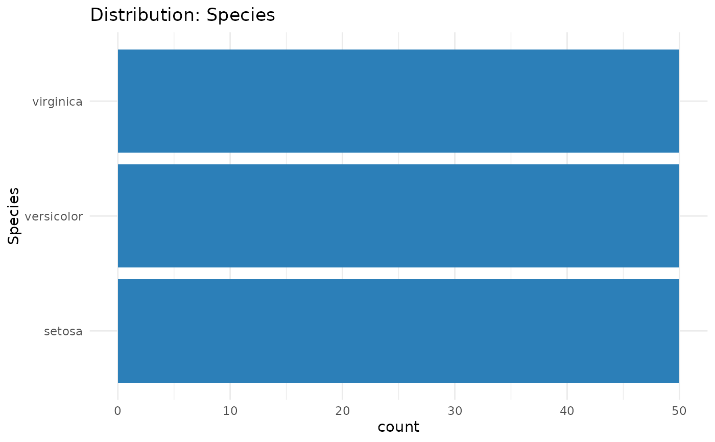
 plot_distribution(iris, "Species")