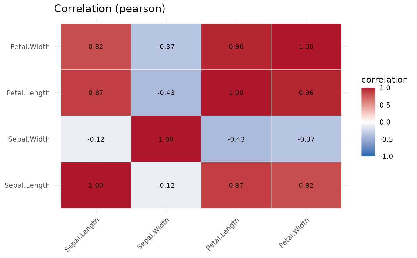
A heatmap of the correlation matrix over the numeric columns, annotated with the rounded coefficients.
Usage
plot_correlation(df, method = c("pearson", "spearman"))A heatmap of the correlation matrix over the numeric columns, annotated with the rounded coefficients.
plot_correlation(df, method = c("pearson", "spearman"))