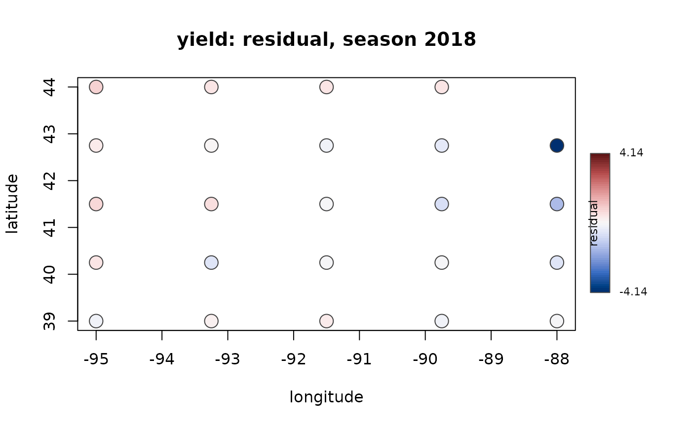
Draws each management unit at its coordinates, coloured by what the model produced there. The uncertainty map is the one worth reading: a model can have acceptable average skill and still be useless over part of its area, and only the map shows where.
Usage
plot_map(
  model,
  what = c("prediction", "residual", "uncertainty"),
  season = NULL,
  level = 0.9,
  ...
)
Arguments
- model
A model fitted by
train_model().- what
"prediction","residual"(observed minus out-of-fold prediction, on a diverging scale centred at zero), or"uncertainty"(the conformal interval half-width, wider where the model is less sure).- season
Optional season to show. Defaults to the first, since overplotting several seasons at one location hides all but the last.
- level
Coverage level for
"uncertainty".- ...
Passed to
plot.
Examples
p <- agri_project(demo_agri_data(n_units = 24, n_seasons = 2))
p <- build_features(phenology_windows(add_climate(p)), stats = "sum")
m <- train_model(p, "yield", algorithm = "lm", k = 4)
#> Warning: 24 features for 48 observations. Unregularised linear learners will be rank deficient here; prefer a tree-based or penalised learner, or pass fewer `stats` to build_features().
plot_map(m, "residual")